Monday, April 27, 2009

3D Drawing


At first when we were told that we needed a photograph for a drawing lesson, i thought that we were gonna be drawing onto them; but when i arrived in the shop i saw a variety of wools, string, fabric, card, chalks and other stuff, so i thought that it was a bit weird.
First we had to create a brainstorm about our photos to come up with some ideas for drawing in 3D. We were then told to go off individually, choose an area of the shop and create a representation of our photos of old Croydon. This was a bit random as we were given 3D materials to build a drawing; but after some thought i found it easy.
I had a photo of an old royal/rich/hotel/posh building surrounded by a rather large front lawn. The building itself mad me think of one of those old murder mystery type films, so i drew a couple of random deaths into a tower, (the tower came from the center of the posh building). I enjoyed it, it was fun; but for some reason the tape didn't always want to stick to the wall, but oh well i liked it.

shop work past 4 weeks

In this workshop we were asked to create and position lettering around the empty shops site.
We were trying to achieve an installation feel to our work really trying to focus on the placement, size,effect and 3rd dimension. We achieved this by using unlikely but useful materials sucha as a box of matches in one exercise and cardboard and tape in another.
For the match box exercise i decided to create the letter B out of tape and the insides of a matchbox. I used both the wall and the floor to position my type as i thought it would give a different look to other letters. Overall i felt my piece was quite a success as i managed to use matches and tape to produce quite a large scale letter. However to some my piece may come across as a bit sketchy and not clear due to some uneven lines and techniques used.
The cardboard letter exercise i felt gave me more of a chance to express my self. As you could work on a larger scale and be alot more creative. My group decided on creating the word flops and i chose to create a 3D letter S. I used a box and cut out the initial shape and then embossed the letter by creating a raised outline of the letter. Although i didn't manage to fully finish my letter i feel it was a success. It went well with one of my colleague's pieces but didnt really fit in with the rest of the groups style.
Projections workshop. This was a fun workshop as i found it interesting playing around with the use of light an shapes created by the light. We made slides for one part of the workshop looking at the use of smaller items such as dust and crums an see what they looked like when enlarged under an OHP projector. Another part of this workshop was creating a light based installation this was the part i most enjoyed. I gave me a chance to express and develop previous ideas. My piece involved a stencil of an object in the room and the use of tape and the surroundings and an uplight.

Matchbox Typography!


Matchbox Typography!

The match box workshop was different for anything we had done so far! This is because our sources were limited to matches’, a matchbox, masking tape and the shop! So we were giving our brains creative muscle a tough work out. At first there was a lot of wondering about and deep intense day dreaming......and then when one person started to pick up the rest felt the pressure and followed on. I personally believe that when you are most limited you can be most creative! This was not the case this time round. Well no exactly. Some people did come out with some really creative work but also there were some people e.g me! Who just did not click. Over all how ever the workshop was enjoyable and developed our skills on typography and using the space more.
Year 12 BTEC National Diploma Art and Design

Initial Ideas For Our Installation Pieces

Today started with a brainstorming session that revised all techniques, mediums, concepts, Artist inspirations & the physicality of the space. This allowed us to think about everything that we have produced and experimented with over the last few weeks.
After the brainstorming session we had another hour long period in which we used to go around the space of the shop and decide upon and imagine our instillation pieces for the final show. Of course at this stage we are simply developing our ideas but I know that I already have a pretty strong idea of what I want and hope to achieve.
In my initial ideas I responded to two separate spaces within the shop space. The first is on the main shop floor, which would manipulate the wall. And the second is on a cold stairway. The element of the heat will contribute to my instillation piece.
In my next blog I will post information and sketches of my plans, but at the moment I'm still organising my thoughts.

Sketching around Croydon


We were given one hour to stroll around east/west Croydon sketching buildings with different dry mediums from different angles; i used graphite and ended up with it all over my hands. Finding interesting/detailed buildings was relatively hard, but drawing them was easy; but we had random strangers staring at our sketch books annoying us, but i think that that's because we were sitting in the middle of the path; people kept walking in front of me so i couldn't’t see what i was drawing. I tried to do some fine detailed sketches, but because of the random people, that was a bit hard, as well as quick rough images. I found that the people living the area weren’t too pleased with us standing in the middle of the street drawing; but we still stayed drawing my buildings.
Afterwards we went back to the shop and we were asked to use the space, shapes, colours and textures of the shop to draw one of our sketches, making them become a part of the space in 3D. I chose to use charcoal on one of the insets of the wall. I expanded my drawing so that i could draw my side buildings on the wall panels, this made it look like it ad two layers. I like how it came out looking long and distorted.

The shop, the stress and the s....


After 4 strenuous weeks of year 12 working in The whitgift centre; i can officially say that we are all exhausted. With only 2 weeks to go, the finish line seems closer than ever, and we are now onto the final stage of our installations.
The site inspired work we are working on are certainly ambitious - ranging from cardboard houses to string structures. The next two weeks will be a challenge for all of us - though a challenge i'm sure we are excited and willing to take on - with the promise of a brilliant art show only a stepping stone away.

Introduction to Fanzines & Blogging


Introduction to Fanzines & Blogging

This was where we were introduces to fanzines and bloging. A fanzine is basically a blog but materialistic rather than on the Internet. It can be about absolutely anything! Usually the author or author's do not charge others for their zines unless it is to cover the production cos & in some cases postage. Zines are also left in libraries for distribution (free). This self published publication has been used by great writers as a stepping stone to help get them where they are now, using zines to practice and develop their writing skills. Fanzines faded away in the 1990s, this is because of the sudden growth of the Internet which allows you to put so much more than just a one zine and you can update continuously. We are creating a zine following our progress at the former shop called Legends closed down due to the current economic crisis. How ever im not quite a fan of blogging so im no sure how this will go! Wish me luck!

Light and shadows

We were put into groups and allocated a section of the shop to work with; my group had the area of the stairs and counter. Each person in the group had to do a different job; my job was to use a viewfinder to select an area of my area, then I had to draw it tiny onto a piece of cellophane. I then had to stick it into a plastic slide and decide where I wanted to project it and talk about it to the rest of the class. Others had to go around and take scratching of the different textures, make images on the walls with tape and string, some people had to select an area of the shop and make a stencil to put on the projector and project it onto the wall. I admire how each projection was different, some were in slide shows, shadowed on the ceiling, flashing onto a certain part of the wall and moving round in circles. I liked the way that everyone had a different opinion on how their pieces should have been presented; lots of them had movement which gave the pieces unique personalities. If I had to repeat the process I would probably brainstorm my ideas first and experiment more with the lighting.

Final Installation : Initial Ideas

Today we've been beginning to think about the final installations we want to fill the shop with. We were asked to propose 2 spaces, thinking about concept and locality, which we will create an installation in.

I was really inspired by the illustrator Kyle Pierce, who works on top of photographs, but his work is all 2D. So I'm thinking about creating a piece in the style of Kyle Pierce using blown up photographic images and OHPs to add text. Here's an example of Kyle Pierce's work.

Josie Bygraves-Visual Arts and Design-Yr 12

THIS WEEK 20th Monday to the 24th Tuesday

THIS WEEK 20th Monday to the 24th Tuesday

This week I have realized that about ½ to 2/3 of Croydon is actually boarded up, because down ever side street you will find that there are shop left right and centre that have been shut down for years. Croydon try’s to fool you into believing it is pristine with it glass building and all the “good” shops but really most of the place is run down I am surprised I only just realised it. Now everything makes sense the reason why Legends was shut down is because it went the way of all the other shops in Croydon that are shut, it’s almost like every few years the whole shopping part is moved leaving behind a trail of there existence. Although there are all these parts of Croydon that are run down there are also good things like they have trams and the centre is very nice. After going out and discovering this (we also made sketches that where used later) we where allowed to draw on the wall this was cool as I always liked the idea of drawing on wall ever since I was like 5 I wanted to get a pen and draw on the wall there’s something quite cave man like to it, so you guys did think about drawing on the wall when you were little didn’t you… no oh I guess that I am just a nut then oh well. So yeah back to drawing on the wall I draw a shop that was boarded up with charcoal and chalk. It was fun.

The next day we where given a bunch of things and we had to create a 3D drawing from an image that we where meant to bring in with us. I was recreating this image bellow.


The materials I used were; silver tape, wood things, wicker wood stuff and wall, I created this with them (bellow)


It looks better in real life. In this room I was basically working alone and it was very quite and a bit boring at times it made me wish that I had an iPod I have been meaning to get one maybe if I use the word iPod enough in this blog apple will give me a free iPod so if you see iPod randomly it is just me trying to get an iPod by advertising the iPod you know because I am cheep and just want to get an iPod but don’t really won’t to get one just in case they come out with the new iPod lick or bitch slap because the touch thing has broken. Yeah that is enough about iPod I think it is safe to say after all that an iPod will be in the post as I speak or type well you know what I mean. So back to the 3D drawing while I was making it a women from outside came in and was talking to me and she said she was proud of what I was creating this made me feel happy. When the piece was shown to the rest of the group people said that they like how I had transformed the room into the drawing and they liked walking in it and exploring.

On Wednesday we were making 3D words that can only be viewed for a certain angle this is sort of like those 4 adverts it the motel and the cliff face, in ours we also used part of the building to form the word and just incase you don’t know what this says it says secret.


On Thursday we were making something called a zine which is meant to be some “cool” word for a free magazine I don’t have any images to show for this as we do all this work on paper and I have not scanned any of it but basically I was just drawing different types of shoppers with pencil.

On Friday me and jack were working together using the projectors, HPO and staff I’m just going to put some of the work and let you think what you like because I am sure you are board of reading all this and as a joke to go out on… Fooled you no there is no joke sorry for getting your hopes up.
a hole in light, get it? it's a pun on a hole in one... oh god my talents are obviously wasted here :(

Wednesday, April 22, 2009

Reinvent historical Croydon

For Reinvent historical Croydon students each selected an image of old Croydon from research carried out at Croydon Library. Working in small teams and independently they investigated the images and chose a theme of interest from each image, they then used this theme to help them locate an area in the shop to install a re-interpretation of the original image using mixed media materials.


Monday, April 20, 2009

Flyer for our Shop installation


PROJECTOR STUFF

EXPERIMENTING WITH LIGHT:
The first thing that we actively got involved with was using light from a projector to shine through transparent objects. To start this task, we went out to find objects that related to the shop/shopping centre. I used some dust and some sticky stuff that I found on the floor of the shop. Using the projector was interesting because it was like looking at something through a microscope. To make the slide to go in the projector, I cut two pieces of acetate and put them in two holders and then sandwich the object in between. After this, we were split into groups and set tasks. I really wanted to do the mobile and use light with this because I had a good idea of what I wanted to do, but I got landed with drawing small details of the shop on acetate which were then projected. Unfortunately, after I had finished I had to go so I did not get a chance to see what the other members of our group did or what the other groups did, but I am sure that it was good?

TYPOGRAPHY

Typography workshop:

In our lesson today we where working with the shop and creating installation like typography piece, in this workshop we where using many different aspects of the shop trying to incorporate the structure, architectural features, quirky details of the shop and things that relate to the way the shop would have looked before it was shut down.

The first thing that we did was to use match boxes and matches to make a letter or word or number or expression mark thinking about haw it integrates with the place that you are working within. This was a good starting place to beginning thinking of typography in an installation was but it was quite hard to think of what to do, or at lest it was for me.

The next thing we did was a group exercise where we were to create a word that related to the store out of card board. The group I was in chose to make the decay because there where 5 people in our group meaning each person made a letter and we felt that this word related to the shop as well, as it is in a state of decay. We also thought that it would be good to make the lettering tacky and rustic so as to create an opposing juxtaposition between the word and the place we where putting it, which happened to be on a shelf, and we thought that what was on the shelf before would have been chic and good looking. I like this and found it easier then the first task this was probably because we where working in groups and the group mentality helped me to overcome the feeling of oh what am I meant to do. I enjoyed looking at the other pupils work and seeing how they had approached the tasks, used their materials and formed there words.


TYPOGRAPHY

On Wednesday we looked at typography and how we could make letters 3D. The task was to turn a material or object into a 3D letter. Out of match boxes we created a way of making a letter, i chose to make the letter ‘T’. I took away the matches from the box then built a 3D base for the letter T shape, then stuck the matches around the boxes so the letter looked as if it was built up of just the matches. I was happy with the way it looked and if i was to take it further i would use the same idea but just do a much bigger version.We were then put into groups were we thought up of a word that we thought of when we looked at the shop. The word we thought of was ‘sleep’ because the room was very empty and boring so it made you feel tired. We each made a letter each out of carboard, i made the letter ‘P’ by folding and sticking carboard together forming a 3D letter shape.

typography day!


We were suprised to find out that for our typography lesson, we were given a matchbox to work with!Using this material, we were asked to create a letter, or symbol of punctuation.
After considering the posibilities, i decided it would be more interesting if, instead of using the actual matches or box to create my piece, i would create little matchbox people to symbolise the letters. Furthermore i thought a more quirky and fun approach would be to spell out the well known abreviation, YMCA.
We then went on to use bigger materials to fill a space. The word had to contain the same amount of letter s as there were people in the group, and also represent an aspect of the shop.
anna-yr12 vad student

Shop


On Tuesday we focused on portrait drawing. We began by practising our drawing skills in pairs, using a progression of techniques including continuous line drawing and drawing without looking at the paper, which taught us the importance of looking at the subject rather than drawing from memory. We then discussed the best ways to approach the public to ask them to be a subject for our drawing activities. Once we had established the best way, we went off and got drawing. It was interesting to see the reactions of the public, and I thought that they wouldn’t want to take part, but the majority of people that we asked were more than happy to help.

On Wednesday we looked at lo-tech projection methods, which included using an OHP, slide projector, and Halogen lights to create silhouettes around the shop space. First, we went off to find a small object that we would be able to shine light through using the slide projector. The objects had to be thin enough to fit into the slides, so I chose a till receipt. I cut it down to size and placed it into the projector. It was quite simple to use, and it resulted in an interesting pattern on the wall. Other objects that were used included some bubble wrap, a leaf, a fly and a piece of plastic packaging. These ordinary objects were much more interesting when enlarged and projected onto the different surfaces that made up the shop.

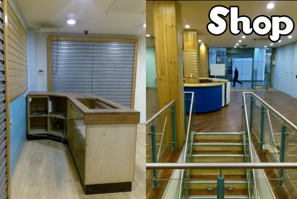
Our next task was to get into small groups and distribute the tasks that had been given to us within the groups. My task was to make a stencil by drawing a small section of the shop, and to shine a light through it to project it. I chose to draw a simplified version of the stairs on the lower floor, and projected it onto the side of the stairs using the OHP. It was interesting to see such a simple shape being projected onto a surface and making an interesting effect.

Some other pieces that were made included a stencil of an area of wood that was then projected onto a wooden surface. Also a series of exit signs hung from the ceiling that pointed in every direction, and moved as the halogen light was rotated around the signs. Another piece was a collection of light switch stencils that had been hung from a hole in the wall, which made shadows underneath. I think that we managed to make some impressive pieces using only basic materials and machines.

Year 12 BTEC National Diploma Art and Design Student

projection day!


We went out to search the floor of the whitgift to find something interesting to project!
I found a few objects such as a barcode, a nail, and a translucent credit card...
The nail was too thick to put in the slide projector and i couldnt cut the credit card to fit into the slide. Therfore the barcode was the best object!
The barcode was blown up to fit the size of the wall. It looked intimidating but very affective... And also appropriate considering the history of the shop!

I then went on to experiment using a hallugen light. The area i was working in contained lots of holes in the wall.. And due to a previous workshop, big cardboard letters spelled out the word hole. Therefore i thought it would look effective to project lots of little holes all over this wall.. I used circles of black paper hanging from the cardboard already on the wall, and placed the hallugen light infront to create tones and black shadows, giving the illusion of lots of black holes.
anna-yr12 vad student

portrait day!


In this workshop we got into pairs, and created a number of portraits of each other. This included using line drawing, sketches, colour and tone to capture the personality and visual aspects of the person. This was good practice for when we took this workshop to the streets! Luckily, the people we asked were eager to join in, and we managed to get some good portaits of the public in a cafe!

Typography Evaluation

Typography Evaluation

Match sticks

At the begining of the lesson we where given a box of match sticks and told to create a letter, number or symbol out of the match sticks and the boxes. We were also allowed to use masking tape but nothing else. We were not allowed to stick the matches together which made things more difficult. I chose to do the letter E. I used both slide shutters of the match box and all the matches to create the letter E. I then suspended it from the ceilings in one of the changing rooms. It was very interesting to see how other people had used there resources.


Posted on behalf of Dean Parker, year 12 visual arts